
ReGo
The recycling revolution begins in Gothenburg
BRIEF
Focused on making an impact in a chosen industry by developing a new product with a tailored design system while collaborating within an agile team.
GOAL
Identify the challenges faced by individuals in Gothenburg regarding recycling and to develop a solution that encourages, simplifies, and supports sustainable recycling practices in daily life.
INDUSTRY:
Waste management
ROLE:
UX/UI designer, UX research
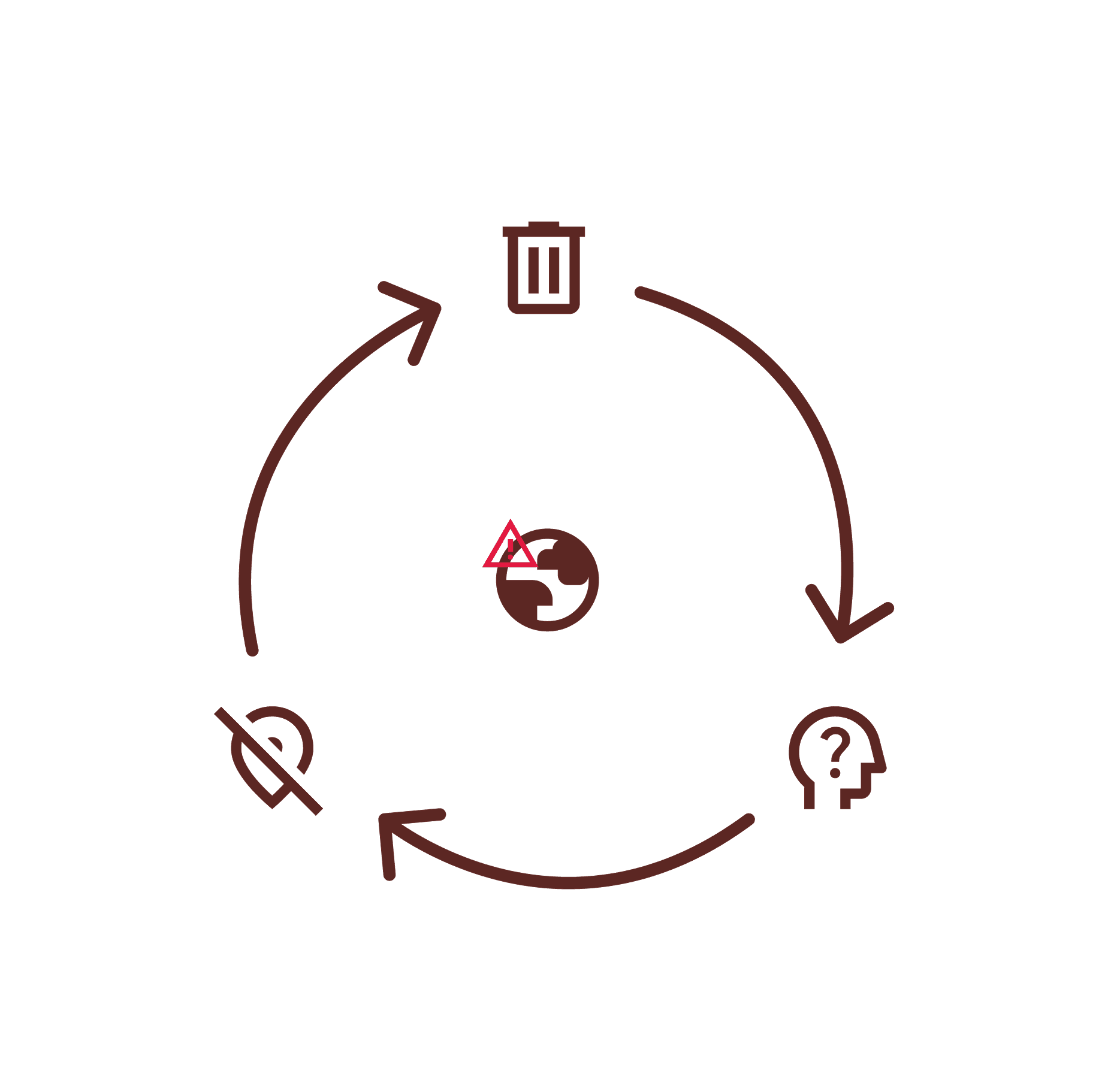
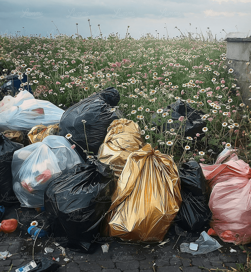
The problem
Recycling challenges, such as limited sorting stations, lack of space, insufficient knowledge, and absence of incentives make it difficult for individuals to recycle effectively. This results in recyclable materials being discarded improperly.
The problem
Recycling challenges, such as limited sorting stations, lack of space, insufficient knowledge, and absence of incentives make it difficult for individuals to recycle effectively. This results in recyclable materials being discarded improperly.

Why is this a problem?
Improper recycling leads to significant global challenges, including increased waste, pollution, and environmental damage. Businesses incur financial losses from wasted recyclable materials and improper disposal costs, while society struggles to meet sustainability goals and reduce carbon emissions, hindering progress on a broader scale.
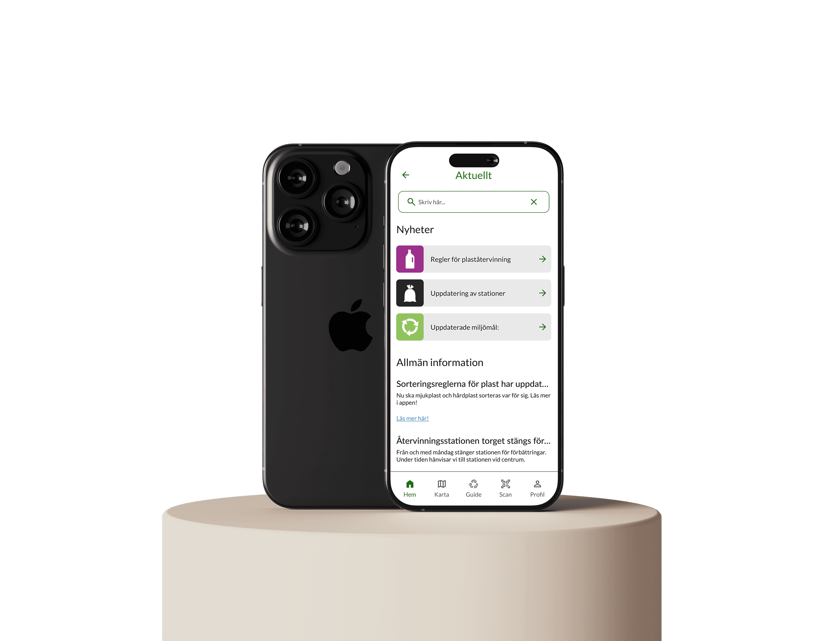
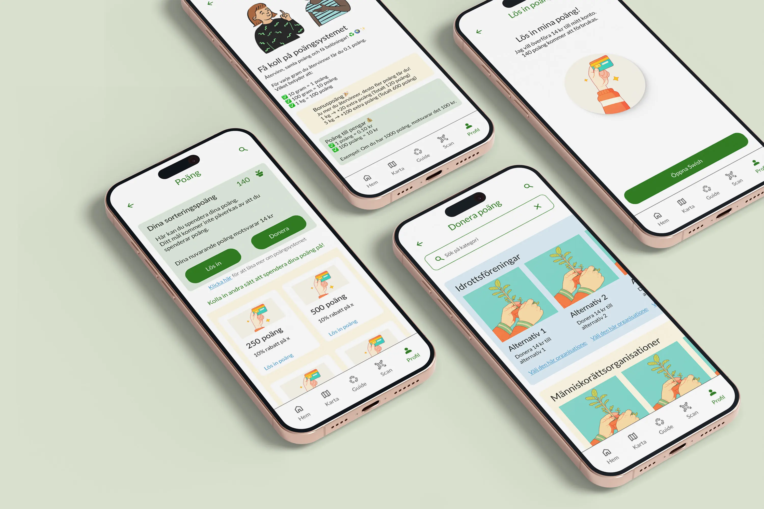
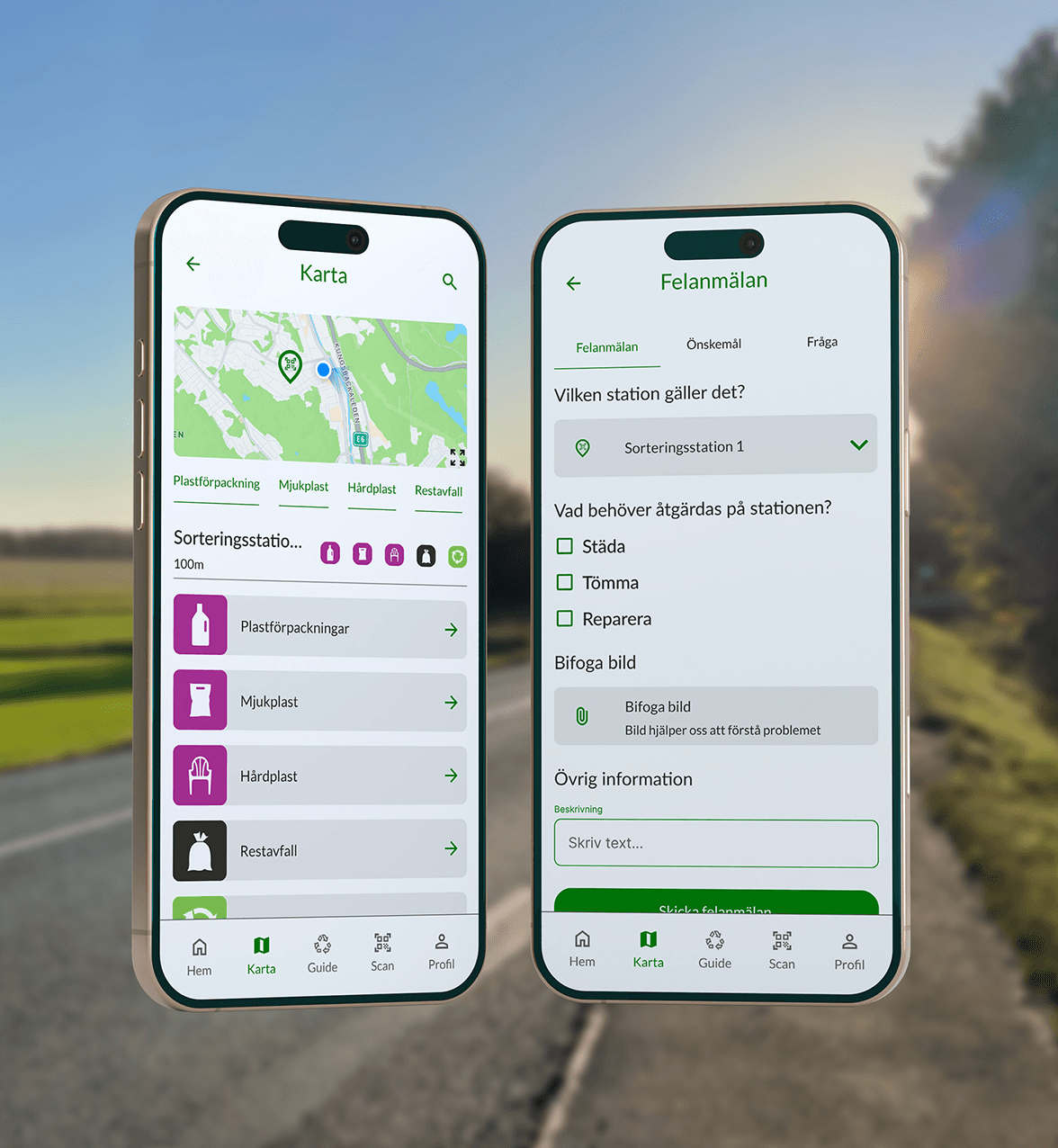
The solution
ReGo – Recycle Gothenburg was developed to provide individuals with:
Accessible recycling knowledge.
Incentivize participation through a deposit-based reward system.
Simplify waste management scheduling.
Offering a comprehensive recycling guide and station map.
The solution
ReGo – Recycle Gothenburg was developed to provide individuals with:
Accessible recycling knowledge.
Incentivize participation through a deposit-based reward system.
Simplify waste management scheduling.
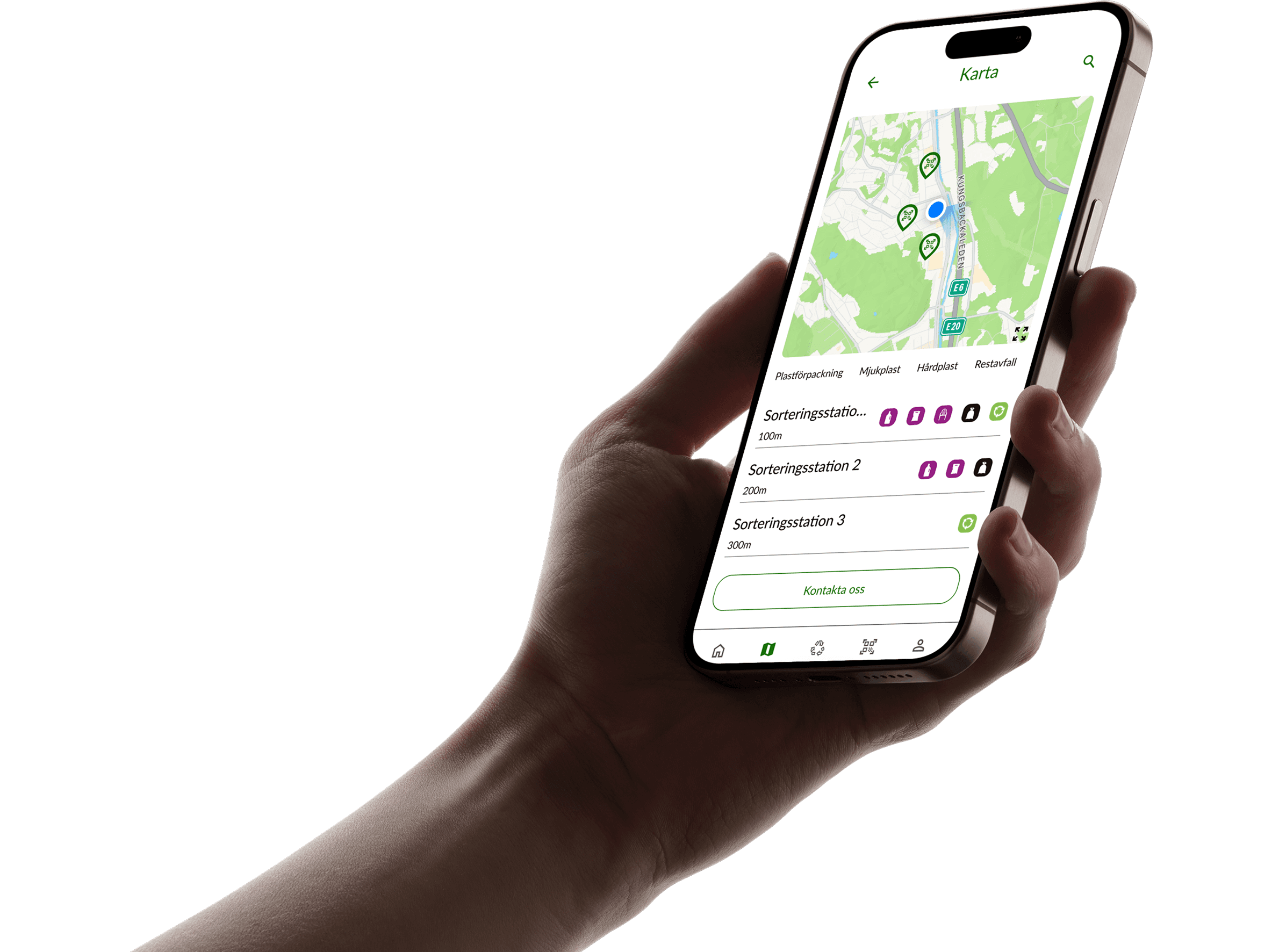
Offering a comprehensive recycling guide and station map.

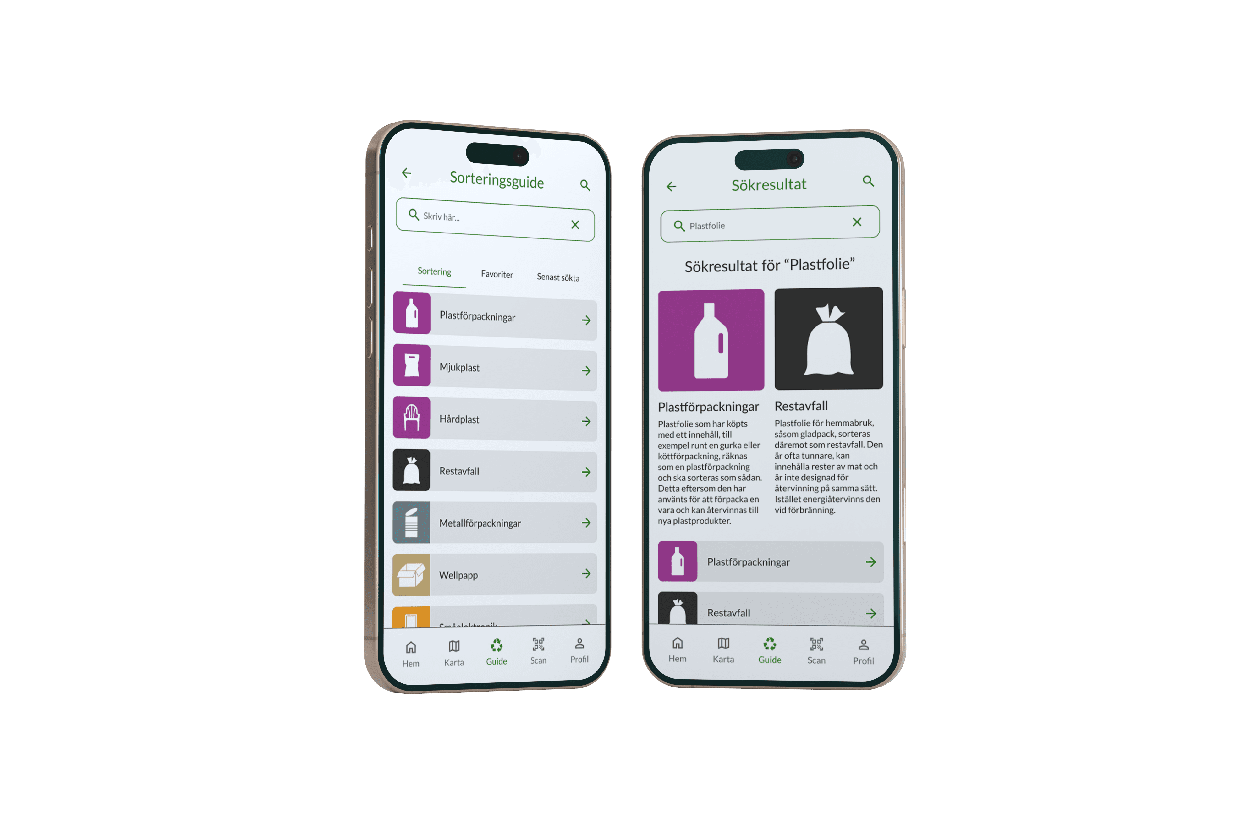
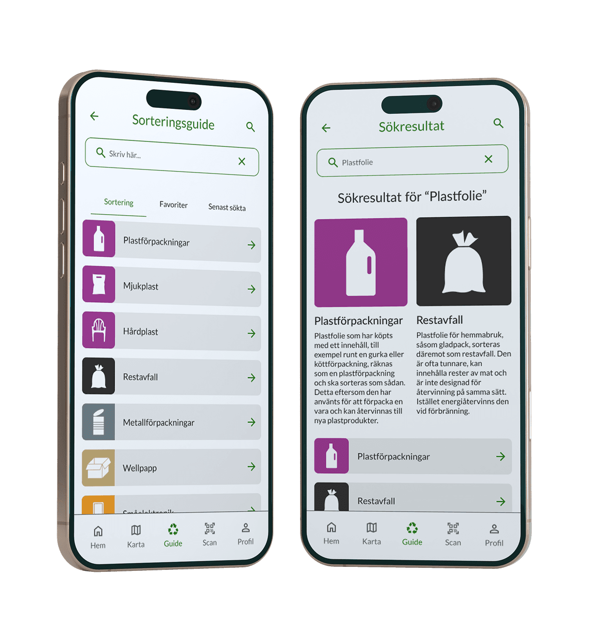
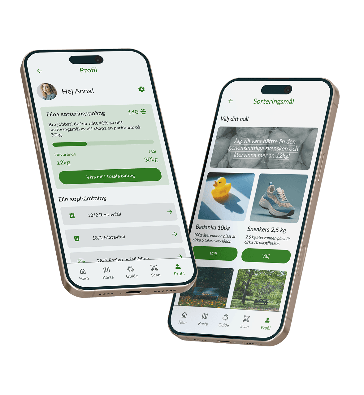
ReGo's recycling guide allows the user to search for specific items and informs of proper recycling. The profile page helps the user keep track of progress, goals and allows for easier scheduling of waste management.
DISCOVER MORE
DISCOVER MORE
Jump to section
Jump to section
Go directly to the part you find the most interesting
Go directly to the part you find the most interesting
Research
To gain a deeper understanding of the challenges individuals encounter with recycling, comprehensive research was conducted:
A workshop, which provided valuable insights into how users experience recycling, allowing us to identify key challenges they face in the process.
A field study, which offered a firsthand perspective on the operational challenges faced by waste management businesses, highlighting the impact of improper recycling and the difficulties businesses encounter in managing waste efficiently.
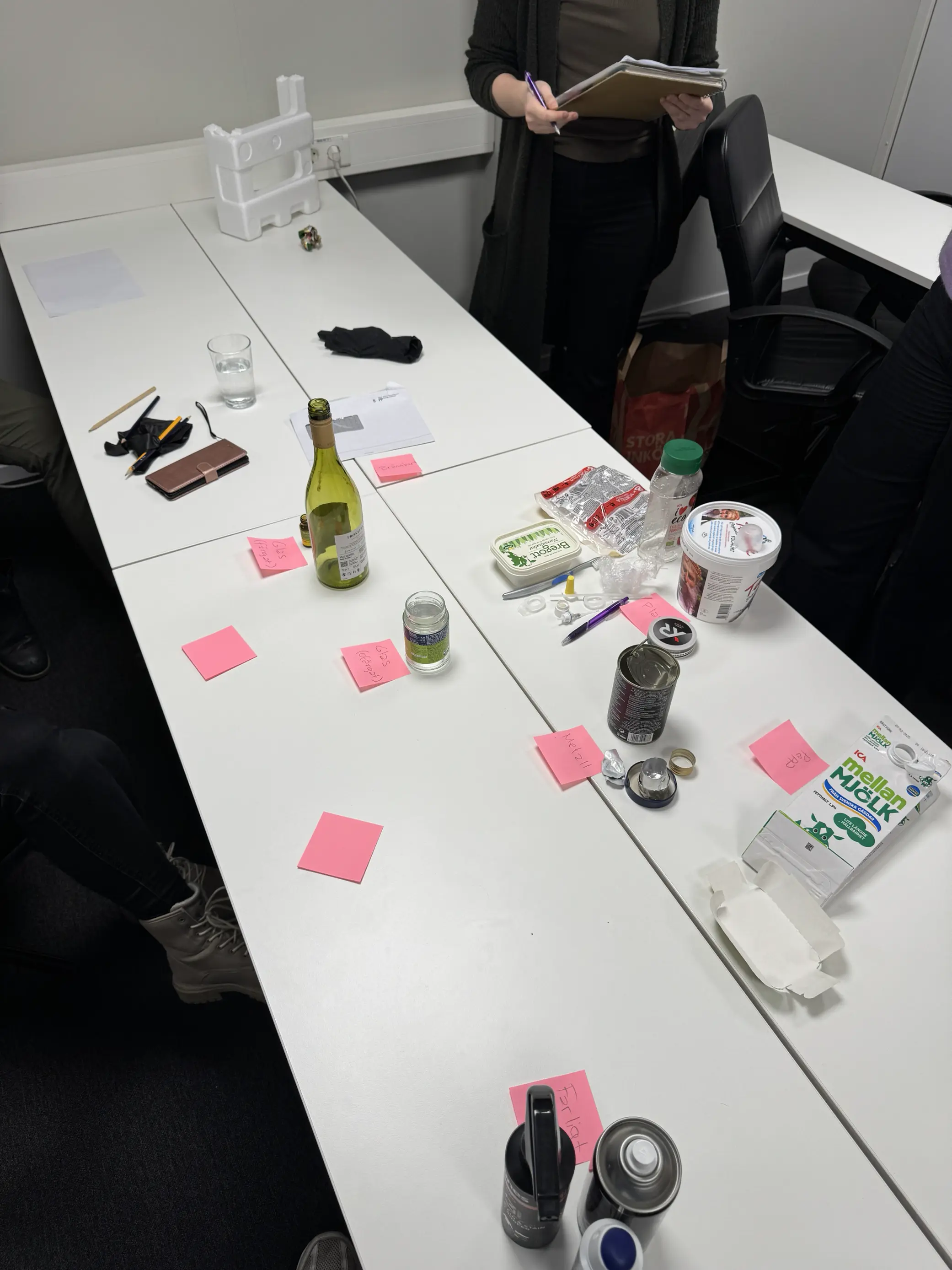
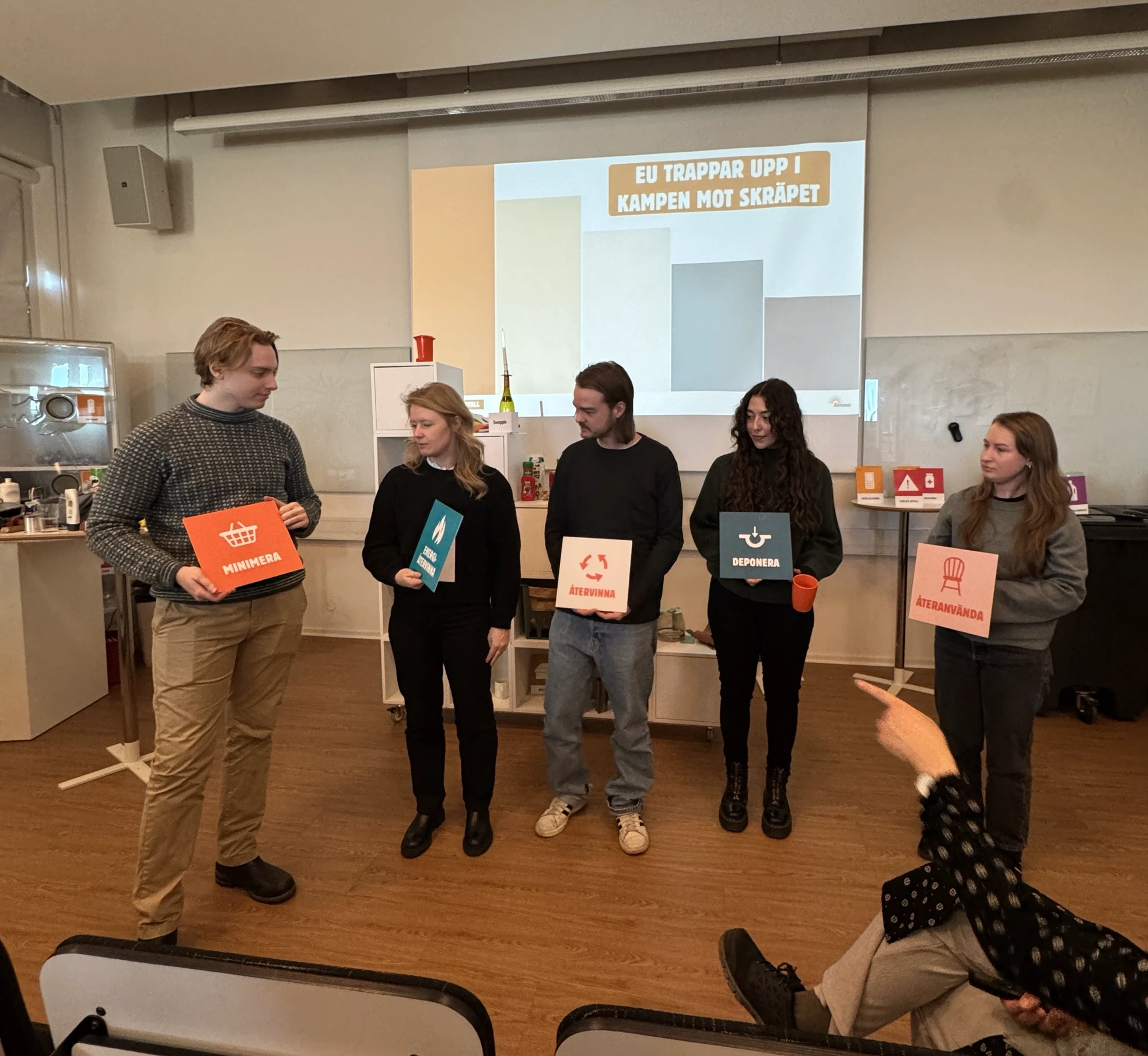
Workshop
To engage nine participants, the workshop was divided into three phases:
Insight Gathering: Using a "Menti" poll, we explored participants' thoughts and feelings about recycling, followed by group discussions to identify pain points and needs.
Mock Recycling: Participants were divided into two groups, both tasked with sorting various recyclables into the correct categories. One group used the 'Bower app,' which features gamification and AR scanning, to assess its impact on sorting accuracy. However, the app’s AR feature faced challenges during the activity.
Knowledge Assessment: A short Kahoot quiz was used to measure participants' recycling knowledge.
Workshop insights
The results from the workshop showed users struggle with the following:
No space at home.
Limited access to sorting stations.
Lack of knowledge and information.
Low motivation.
Note: Many workshop participants suggested fines as a solution; however, this approach was dismissed, as assigning blame to users is not seen as an effective strategy.
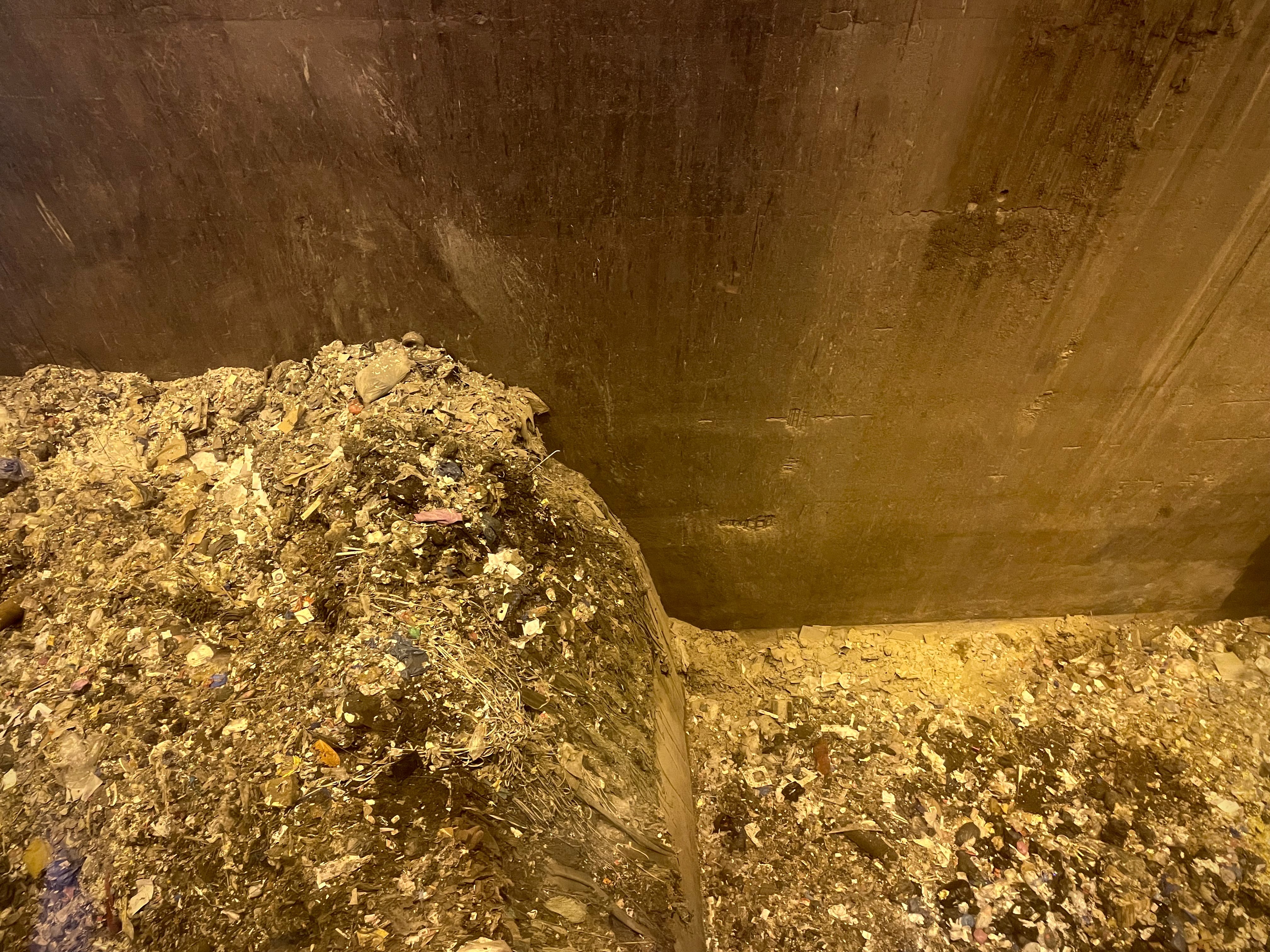
Waste designated for incineration at Renova
Waste designated for incineration at Renova
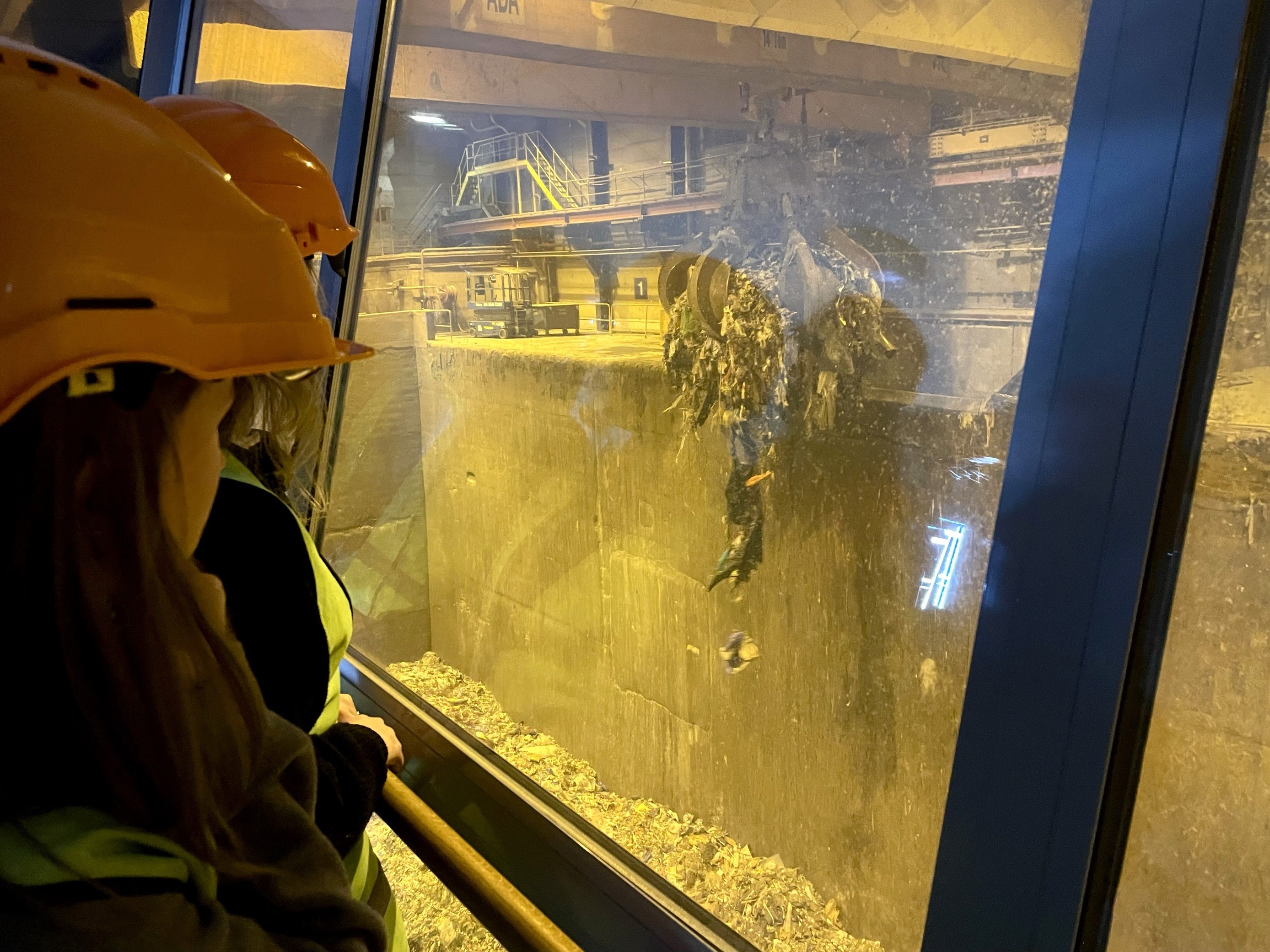
Field study insights
A field study was conducted at Renova, yielding valuable insights.
Key findings include:
Sweden's waste incineration exceeds the EU average, including recyclable plastics, which are lost as a resource. Incineration for energy recovery is also less efficient compared to other waste management methods.
"FastGas" canisters, specifically those containing nitrous oxide (commonly known as laughing gas), pose operational risks, including explosions at incineration plants, resulting in substantial financial losses.
Approximately 20% of packaging is missorted due to unclear sorting instructions and a lack of motivation, particularly for complex items.
Research summary
Research Methods: Comprehensive research included a workshop and field study to understand recycling challenges faced by individuals and businesses.
Workshop Insights: The workshop, consisting of insight gathering, mock recycling with an AR app, and a knowledge quiz, revealed struggles such as lack of space, limited sorting stations, and low motivation.
Field Study Findings: The field study at Renova revealed excessive waste incineration, operational risks from "FastGas" canisters, and high missorting rates due to unclear instructions.
Gaps in Recycling Engagement: Research identified a need for more interactive and accessible recycling solutions, including visual guides, multilingual support, and tailored incentives.
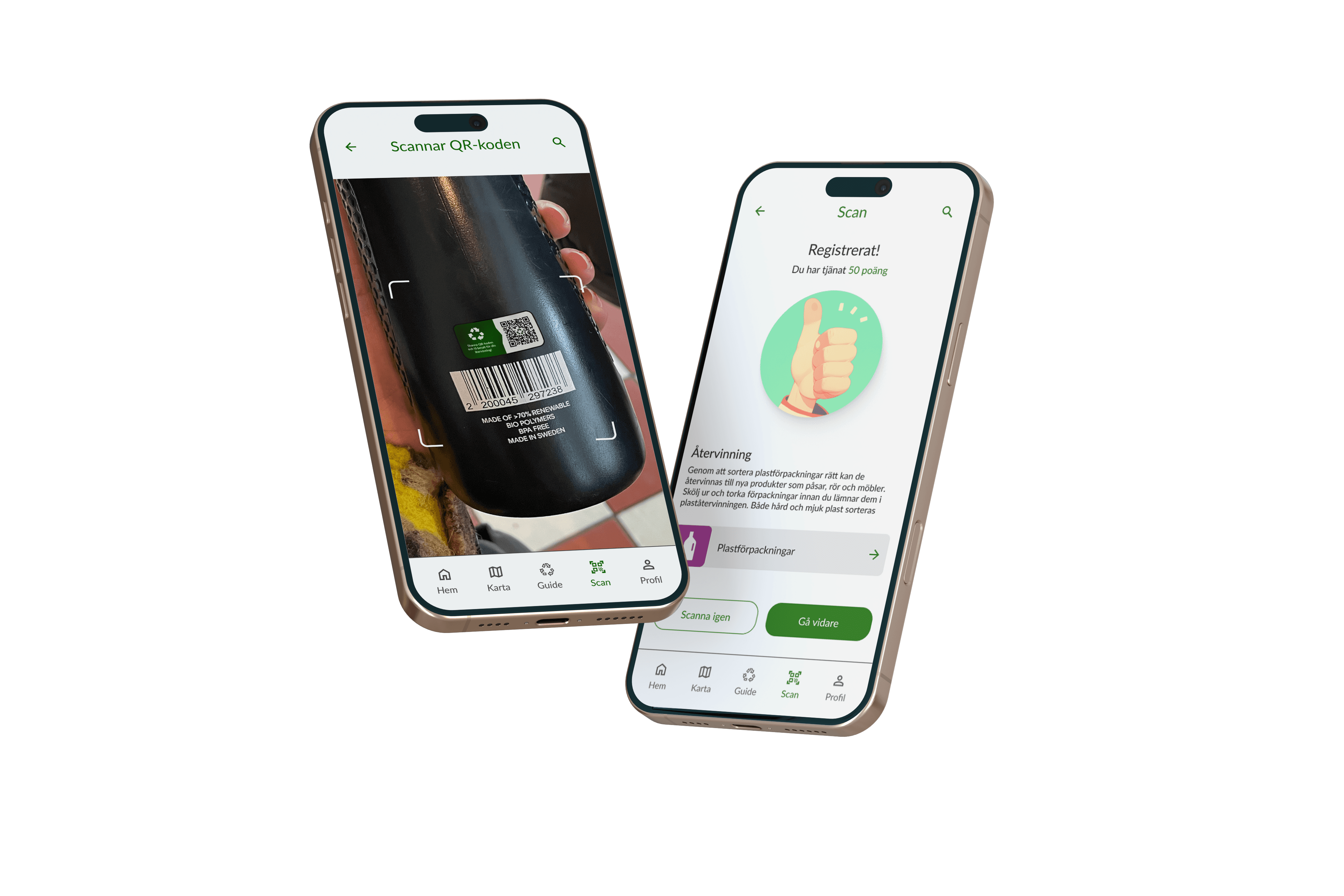
Scan the ReGo QR code to earn points and find the correct recycling category
Research summary
Research Methods: Comprehensive research included a workshop and field study to understand recycling challenges faced by individuals and businesses.
Workshop Insights: The workshop, consisting of insight gathering, mock recycling with an AR app, and a knowledge quiz, revealed struggles such as lack of space, limited sorting stations, and low motivation.
Field Study Findings: The field study at Renova revealed excessive waste incineration, operational risks from "FastGas" canisters, and high missorting rates due to unclear instructions.
Gaps in Recycling Engagement: Research identified a need for more interactive and accessible recycling solutions, including visual guides, multilingual support, and tailored incentives.
Scan the ReGo QR code to earn points and find the correct recycling category
Design system
Following the research phase and identification of key pain points, a design system was developed to bring ReGo to life.
The primary focus was to create a seamless, consistent design system aligned with WCAG 2.2 directives.
This was a collaborative effort involving Tamiko Nilsson, Frida Andersson, Lukas Lindberg, Ambjörn Olsson and Nathalie Hirvonen Franzén, as part of an ongoing agile process.
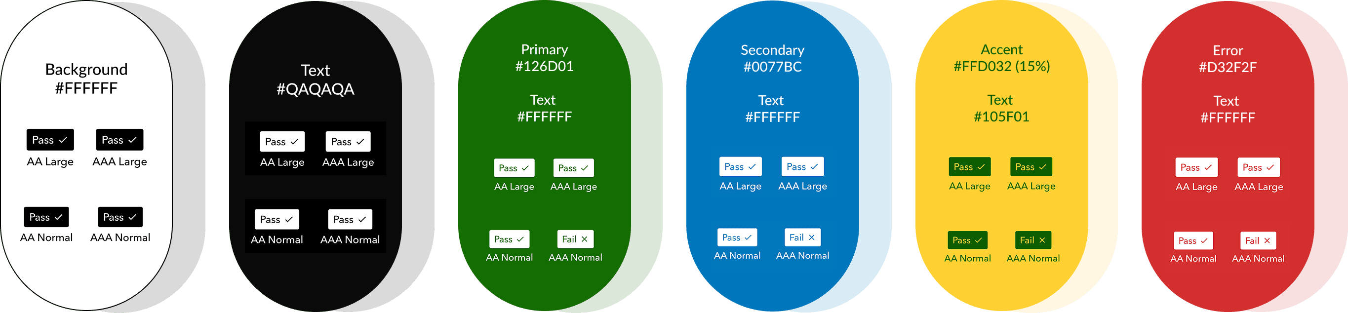
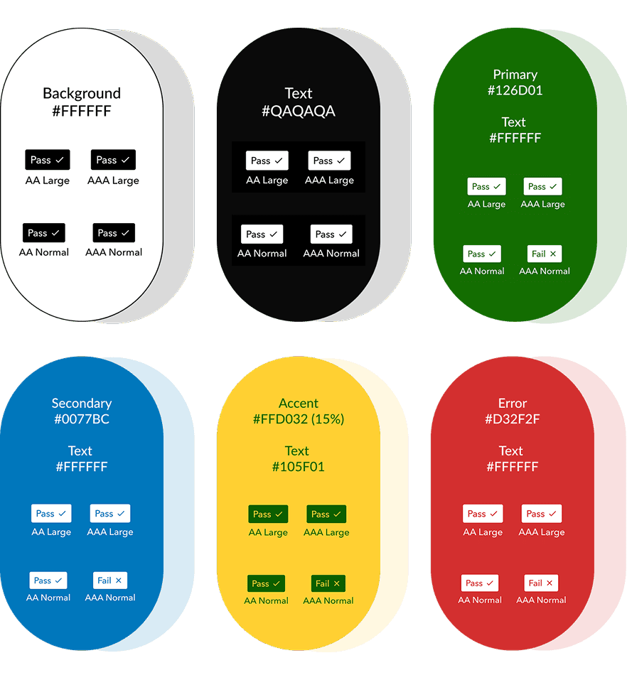
Colour palette selection
As mentioned, the primary focus when selecting colors was to ensure they met WCAG 2.2 accessibility requirements.
Initially, the idea was to use Gothenburg’s iconic colors, but as development progressed, the focus shifted to green to emphasize the app's environmental theme. The classic blue and yellow of Gothenburg were used sparingly, with an opacity of 15%, while blue at full opacity was specifically used for links.

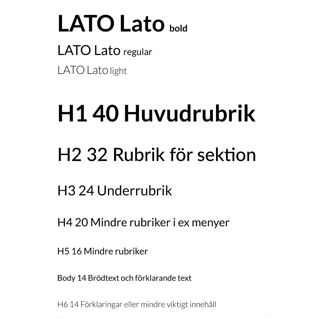
Font selection
Lato is a sans-serif typeface with rounded edges, offering a warm, approachable feel while maintaining a clean, simple design. Widely used in magazines, business cards, and promotional items, Lato ensures high readability across devices and screen sizes. Its simplicity and clarity make it an ideal choice for the ReGo app, catering to a diverse user base in Gothenburg. Lato’s design aligns with WCAG 2.2 directives, ensuring accessibility and an inclusive, user-friendly experience for all.

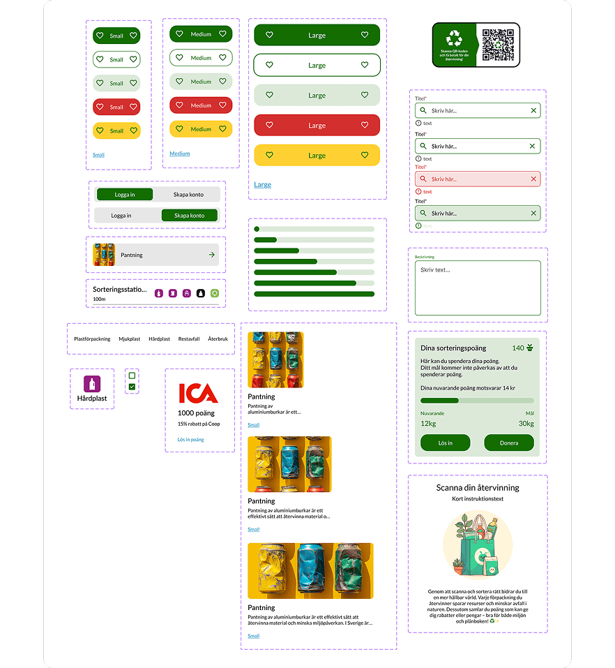
4 point system
ReGo was built using a 4pt system to ensure precise and consistent spacing throughout the app. This system enhances visual harmony, simplifies scalability across different screen sizes, and maintains a clean, organized layout. The proximity spacing shown above helps guide users by visually grouping related elements, enhancing clarity and usability.
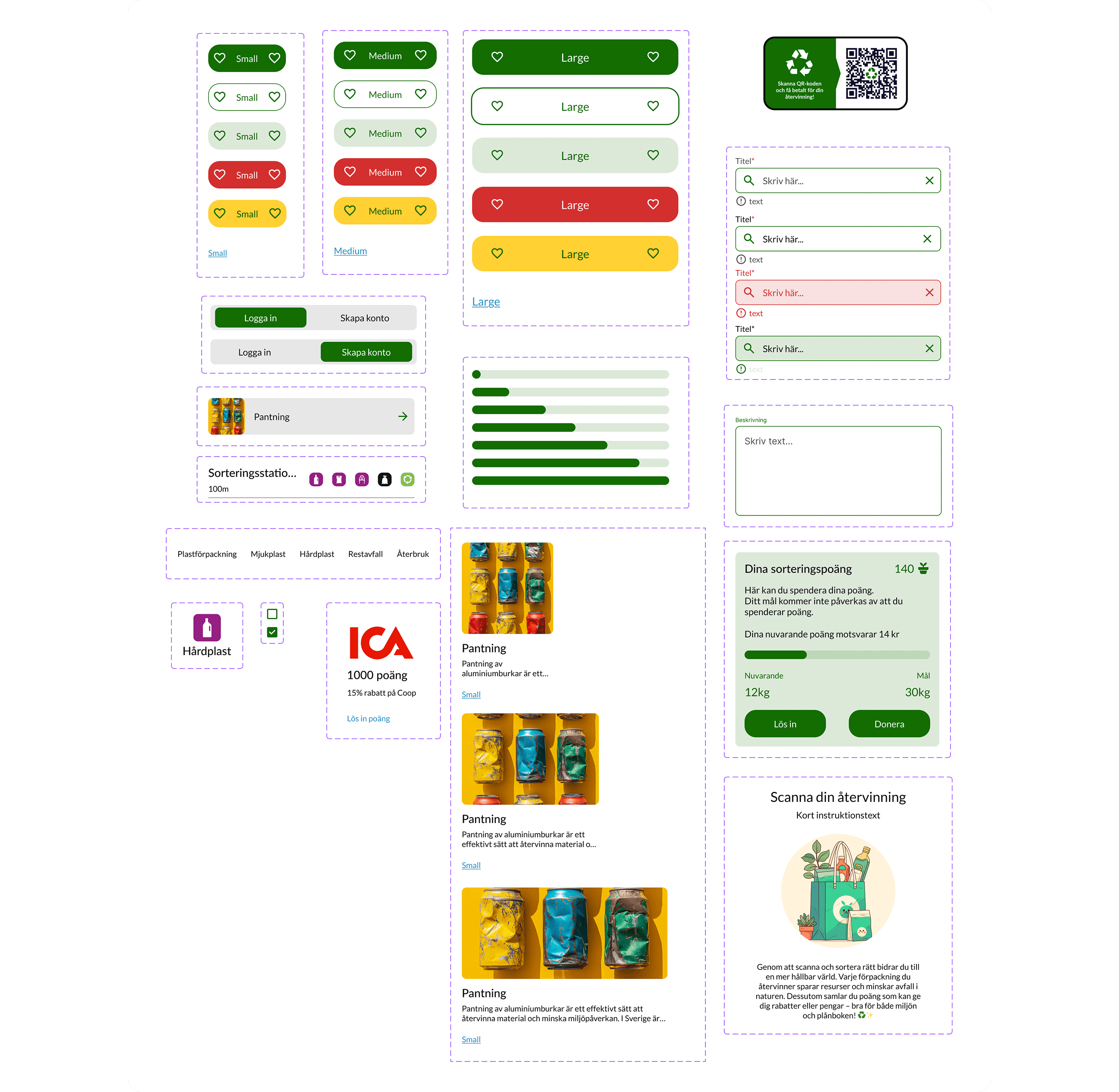
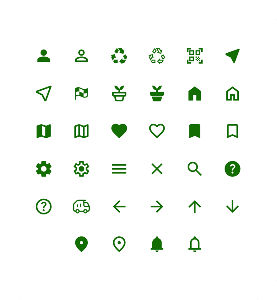
Components & icons
Designed with accessibility as a priority, the components are crafted to ensure easy recognition and maintain a consistent user experience throughout the app. The app includes a comprehensive range of components, beyond those shown in the image, all contributing to a cohesive and intuitive interface.
To support this, the icons, sourced from Google Material Symbols, were carefully selected for their clarity and accessibility, seamlessly integrating into the overall visual language of the app.

Font selection
Lato is a sans-serif typeface with rounded edges, offering a warm, approachable feel while maintaining a clean, simple design. Widely used in magazines, business cards, and promotional items, Lato ensures high readability across devices and screen sizes. Its simplicity and clarity make it an ideal choice for the ReGo app, catering to a diverse user base in Gothenburg. Lato’s design aligns with WCAG 2.2 directives, ensuring accessibility and an inclusive, user-friendly experience for all.
Components & icons
Designed with accessibility as a priority, the components are crafted to ensure easy recognition and maintain a consistent user experience throughout the app. The app includes a comprehensive range of components, beyond those shown in the image, all contributing to a cohesive and intuitive interface.
The icons, sourced from Google Material Symbols, were chosen for their high accessibility and clarity. The app includes a comprehensive range of components beyond those shown in the image, all contributing to a cohesive and intuitive interface.
Design summary
Accessibility & Consistency: Developed to align with WCAG 2.2, ensuring a seamless and inclusive user experience through a consistent design system.
Color Selection: Initially inspired by Gothenburg’s colors, the palette shifted to green to reinforce the environmental theme.
Typography: Lato, a sans-serif typeface with rounded edges, was chosen for its warmth, readability, and accessibility, making it ideal for a diverse user base in Gothenburg.
Spacing & Components: A 4pt system ensures consistent spacing and visual harmony, while Google Material Symbols icons enhance accessibility. Components are designed for easy recognition, contributing to a cohesive and intuitive interface.
The full summary
Goal and Solution: ReGo was designed to address recycling challenges in Gothenburg by providing accessible recycling information, a deposit-based reward system, and a station map to simplify waste management and encourage participation.
User Research: Workshops and field studies identified key pain points, including limited access to recycling stations, lack of knowledge, and low motivation. Findings highlighted issues like unclear sorting instructions and excessive waste incineration, which hinder sustainability efforts.
Design & Accessibility: The design system follows WCAG 2.2 guidelines to ensure accessibility and consistency. A structured color palette, Lato typography, a 4pt spacing system, and Google Material Symbols icons were used to enhance readability, usability, and a seamless user experience.
Key Learnings: I’ve learned the value of thinking in systems, particularly when creating a robust design system focused on accessibility. Working in an agile team also emphasized the importance of learning from peers and sharing knowledge to achieve the best results. As we lift each other, the outcomes are stronger.