Le Quattro Sorelle
A booking experience based on user needs
BRIEF
Creating web and app design for an Italian bed & breakfast with a seamless user experience, from start to finish.
GOAL
Encourage users to book their stay directly from the bed & breakfast's website by providing a safe and professional website which includes all the users needs, all in one place.
The app is a complementary accessory to assist users during their stay.
INDUSTRY:
Bed & Breakfast
ROLE:
UX/UI designer, web & app design
The problem
Most travellers book through third-party platforms, which may seem convenient but come at a cost for small, independent stays like B&Bs and boutique hostels.
While these platforms offer an easy overview of multiple options, many travellers also avoid booking directly because the B&Bs’ own websites often feel confusing or insecure.
As a result, these businesses lose revenue to commissions, face limited guest interaction, and struggle to stand out in algorithms that favour larger chains, risking invisibility and being forgotten.
Why is this a problem?
When guests book through third-party platforms, small businesses lose more than just profit. They miss the chance to build direct relationships, encourage repeat visits, and strengthen their brand.
Communication becomes impersonal, guest data is limited, and updates to offers or policies are harder to control. Over time, these gaps add up, weakening trust, reducing flexibility, and making it harder for small stays to thrive in a space built for scale.
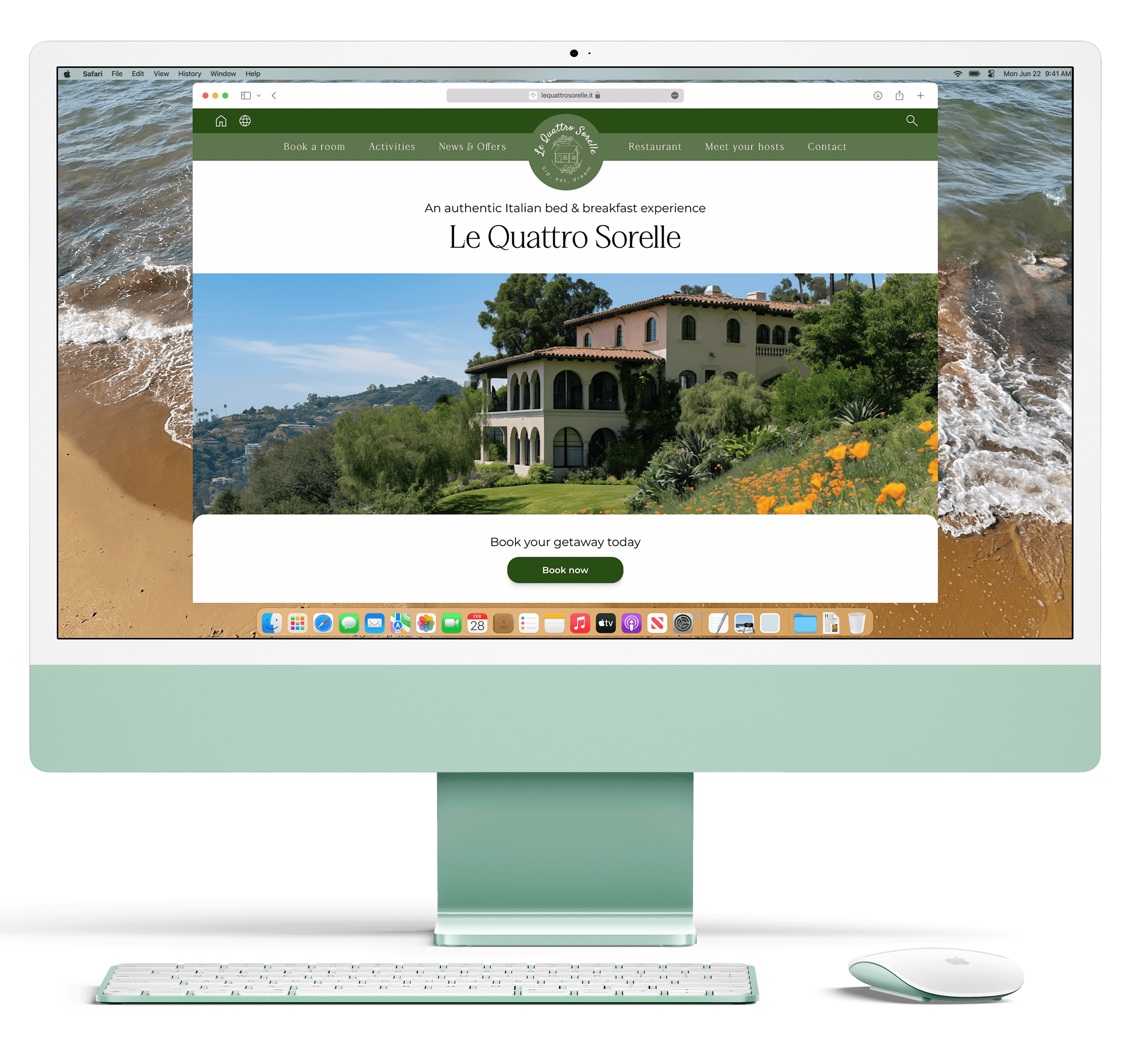
The solution
A fresh, professional website that gives users a sense of security.
By creating a clean, trustworthy digital presence, we help small stays make a strong first impression. The new website is simple to navigate and built to inspire confidence, encouraging more guests to book directly.
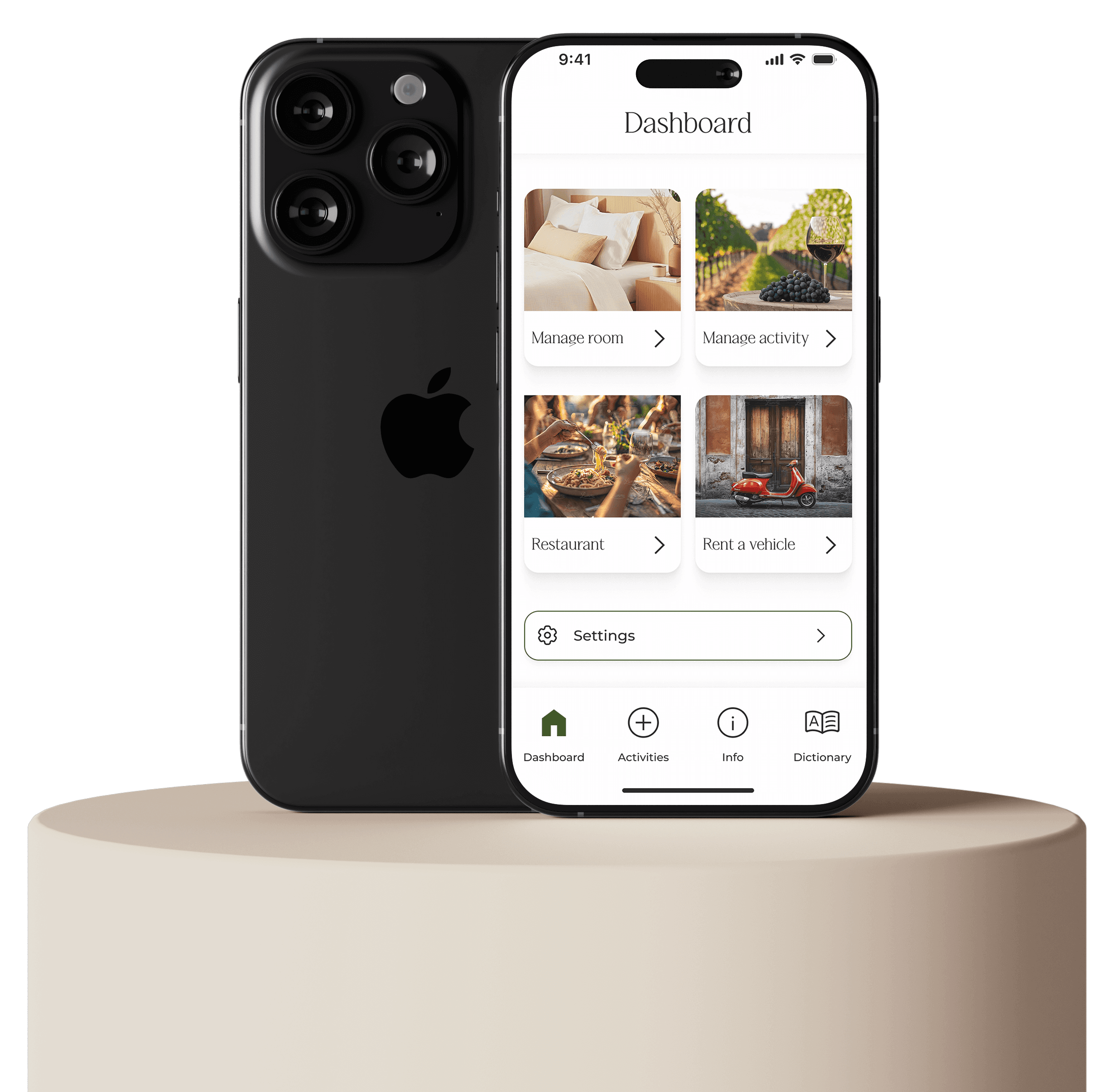
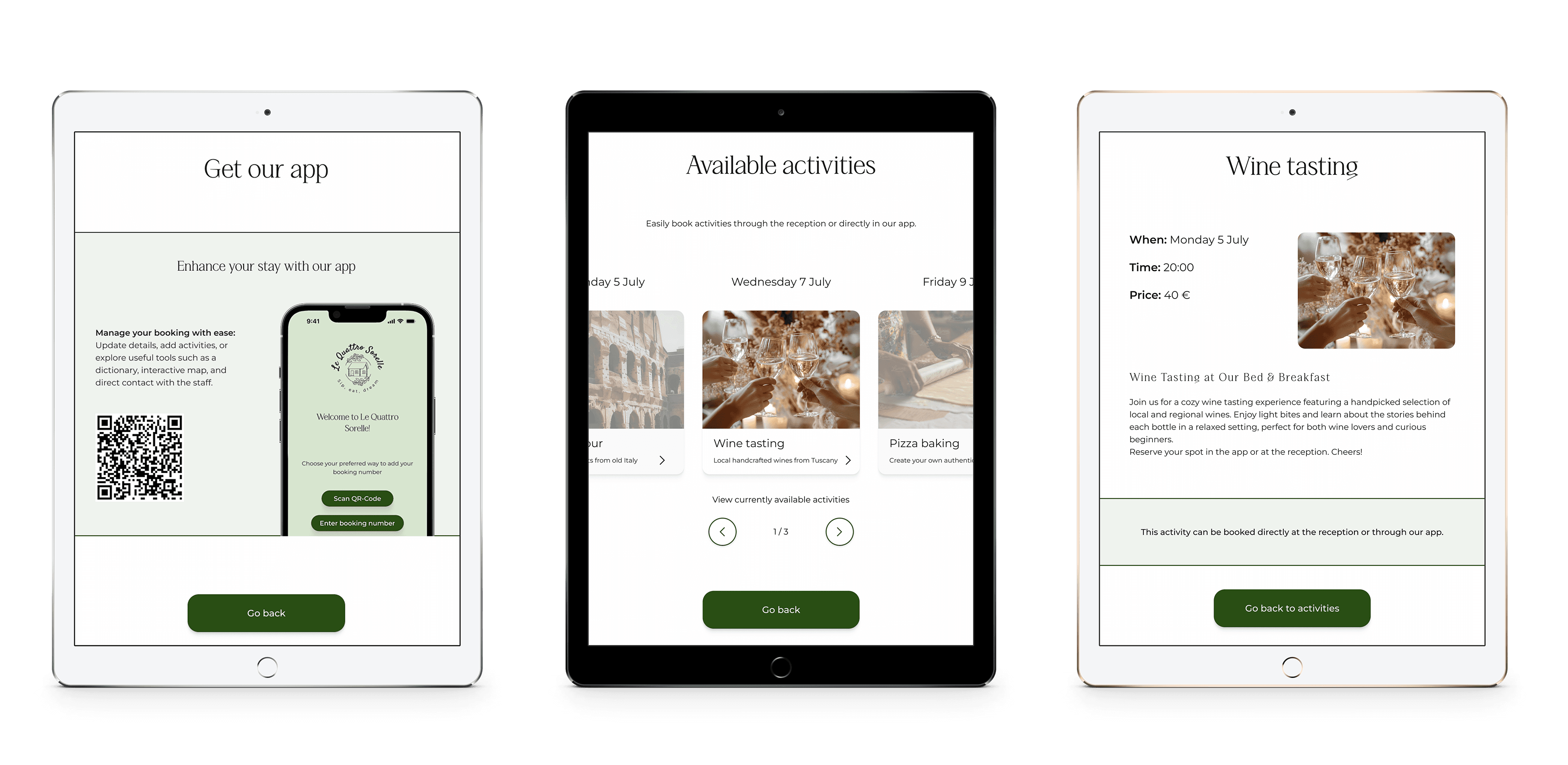
Alongside the website, a complementary app offers guests helpful, trip-specific information during their stay. This not only elevates the guest experience but reinforces the business’s professionalism and care at every step of the journey.
The solution
A fresh, professional website that gives users a sense of security.
By creating a clean, trustworthy digital presence, we help small stays make a strong first impression. The new website is simple to navigate and built to inspire confidence, encouraging more guests to book directly.
Alongside the website, a complementary app offers guests helpful, trip-specific information during their stay. This not only elevates the guest experience but reinforces the business’s professionalism and care at every step of the journey.
DISCOVER MORE
DISCOVER MORE
Jump to section
Jump to section
Go directly to the part you find the most interesting
Go directly to the part you find the most interesting
Design direction
A small survey was conducted to establish a foundation for the design process. The insights were translated into an effect map, which provided direction and helped shape the interfaces for the bed & breakfast.
The goal was to create an inviting and authentic website that helps guests book a personalized stay. The design was informed by four primary user types:
Italy Enthusiast: Guests seeking an authentic Italian experience through food, drink, and culture.
Group Traveler: Small groups exploring together, looking for activities that suit everyone.
Solo Traveler: Guests traveling alone who want to discover local activities and experiences.
Event Guest: Individuals or groups booking a specific event or concept at the B&B, e.g., a wedding.
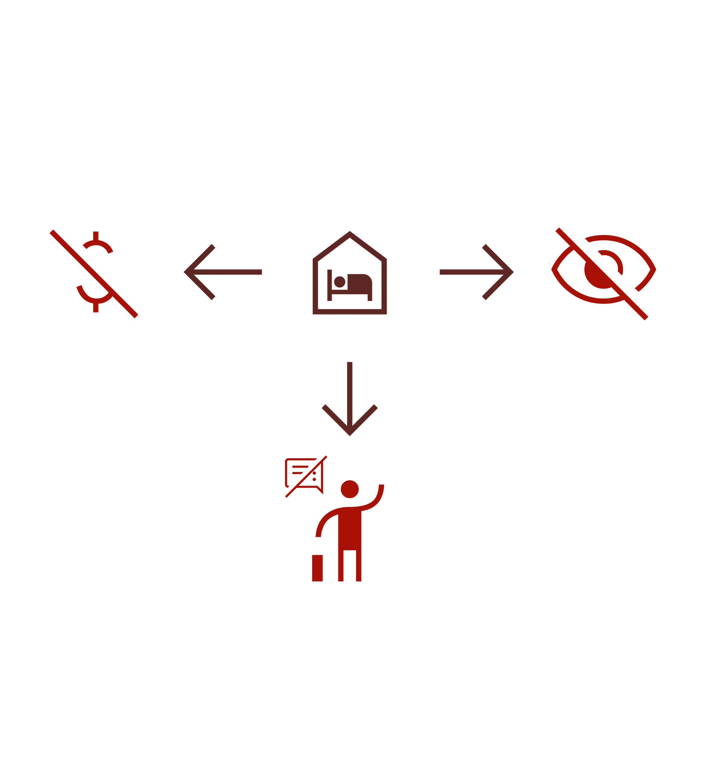
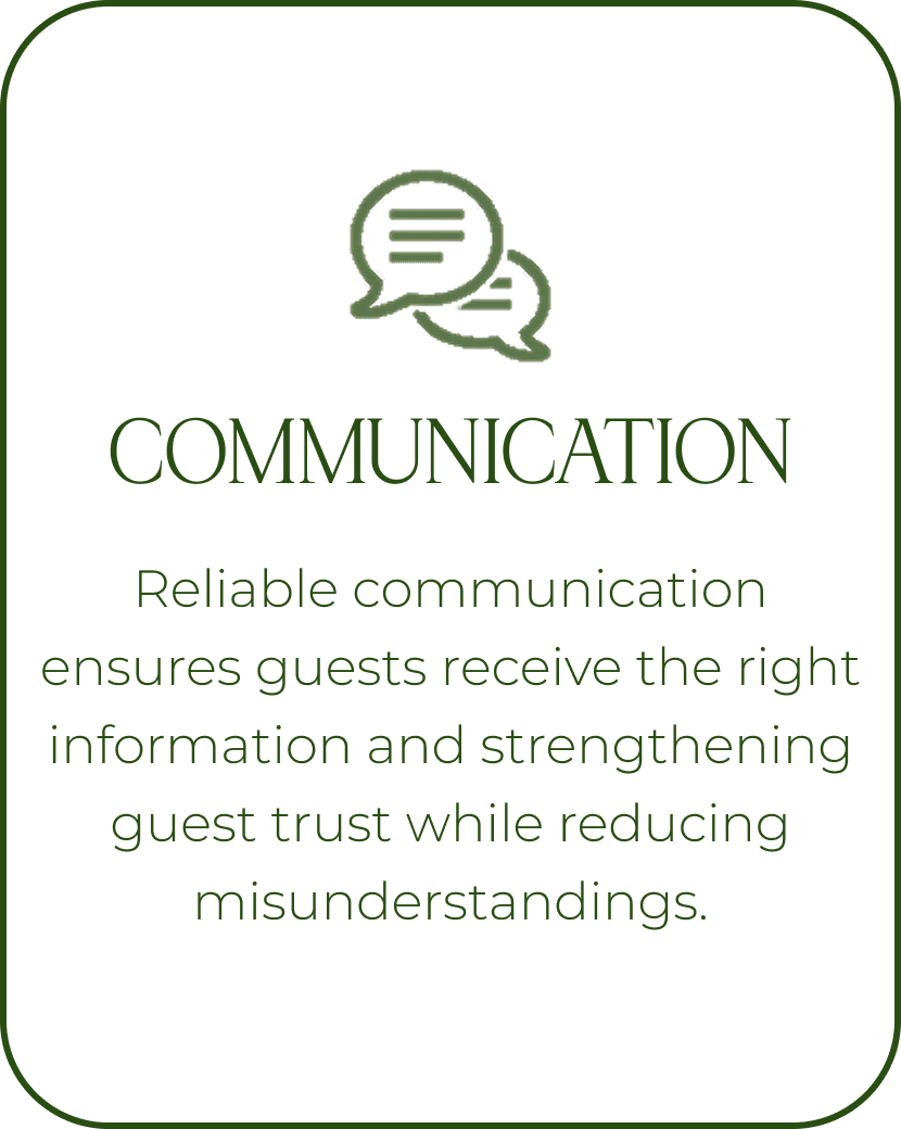
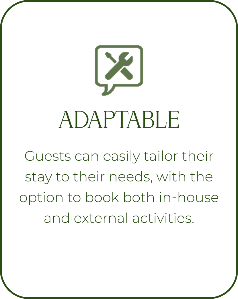
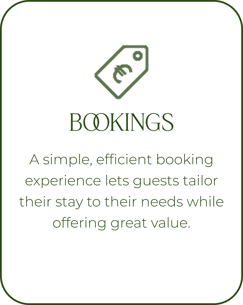
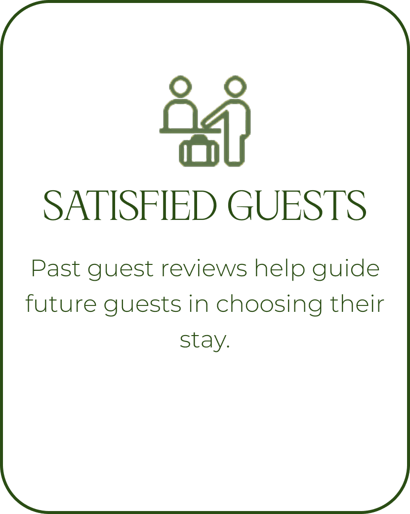
Focus areas
Critical touchpoints identified to guide design decisions and enhance both usability and the overall stay experience.
Focus areas
Critical touchpoints identified to guide design decisions and enhance both usability and the overall stay experience.
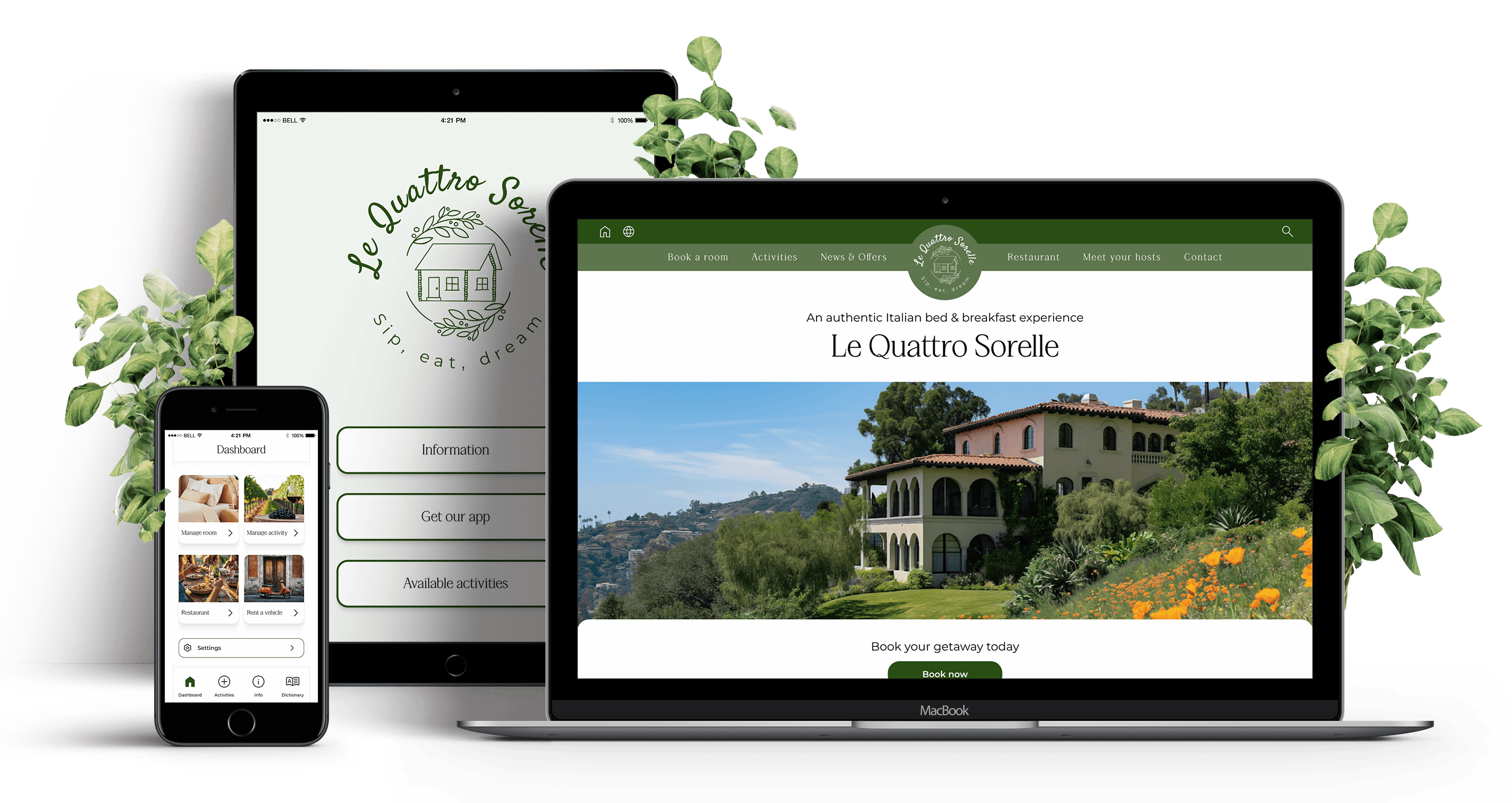
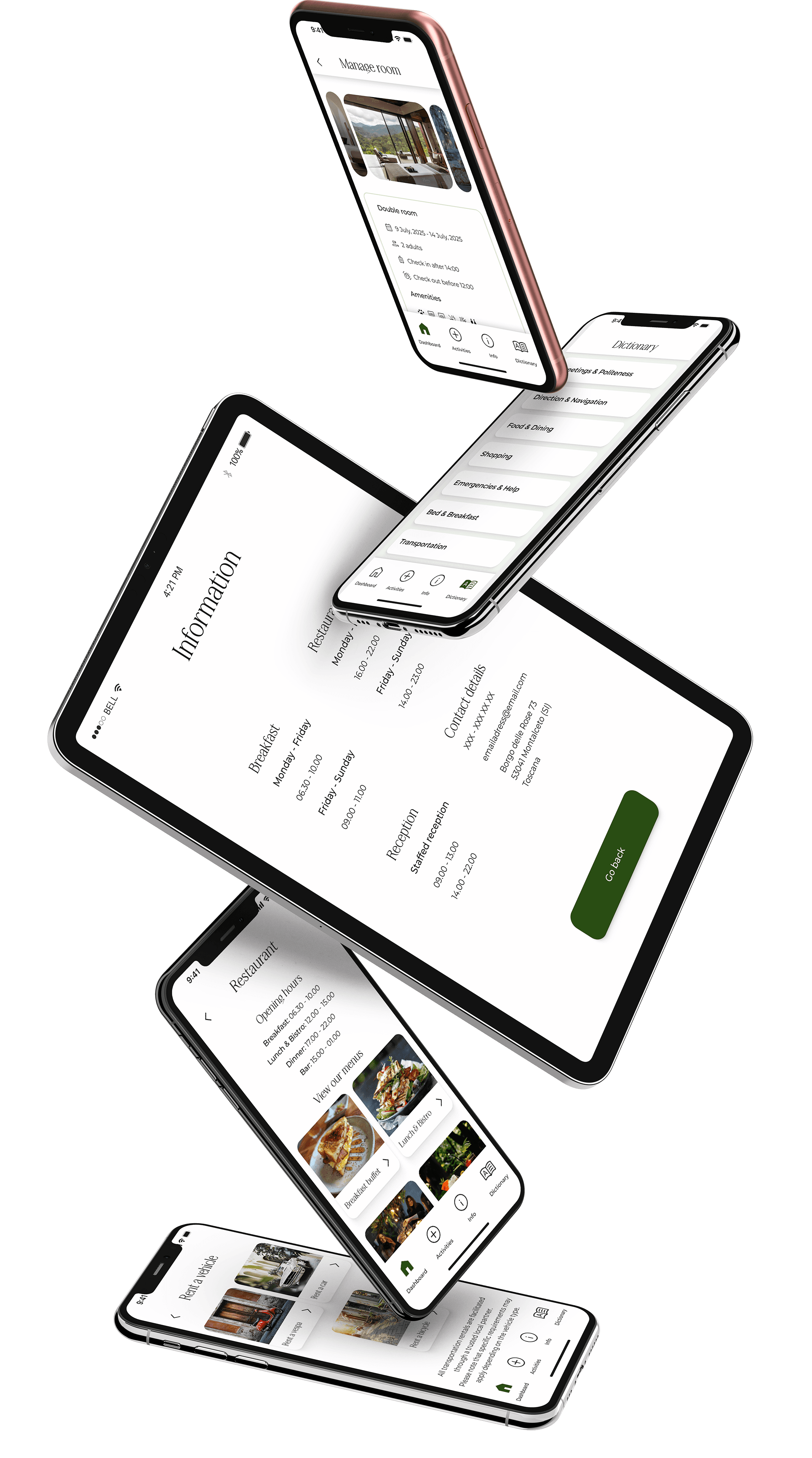
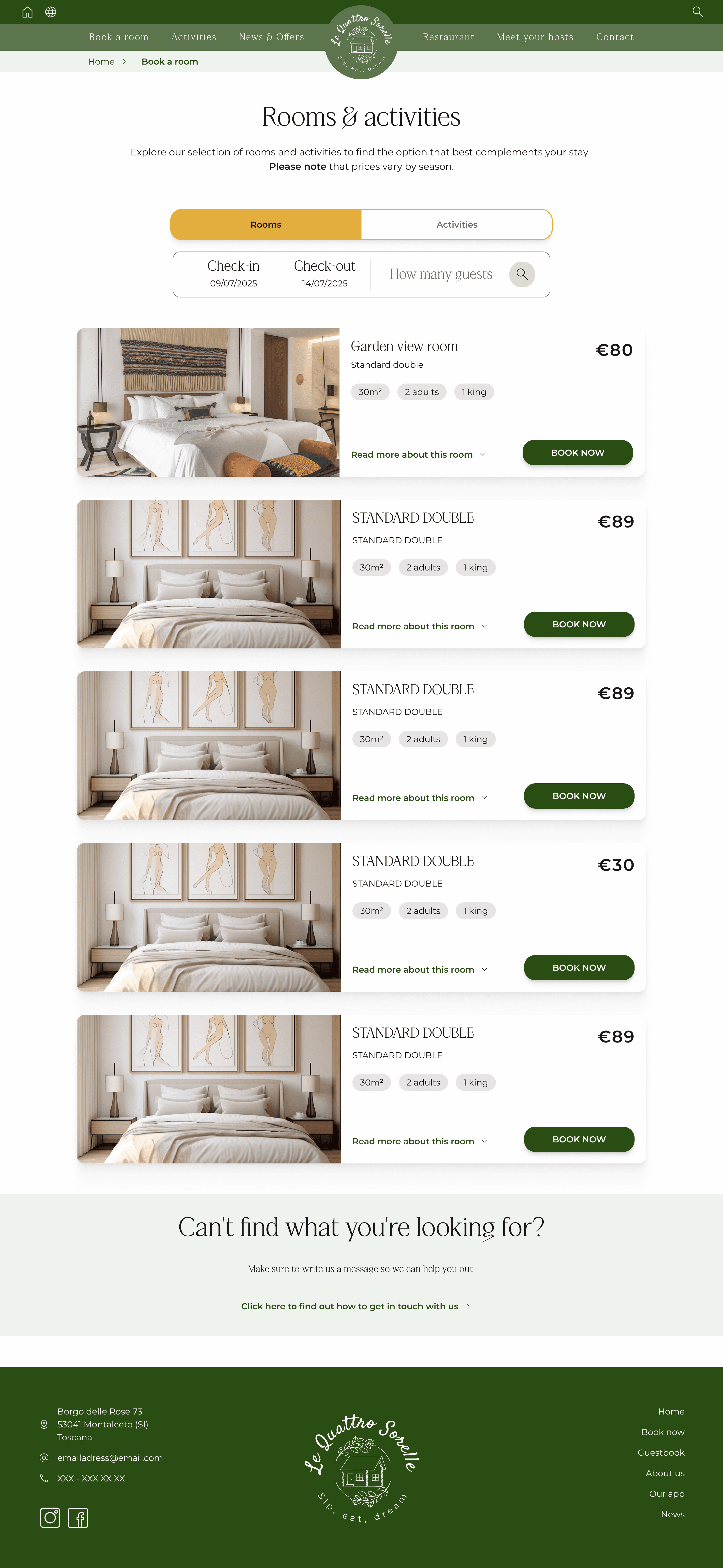
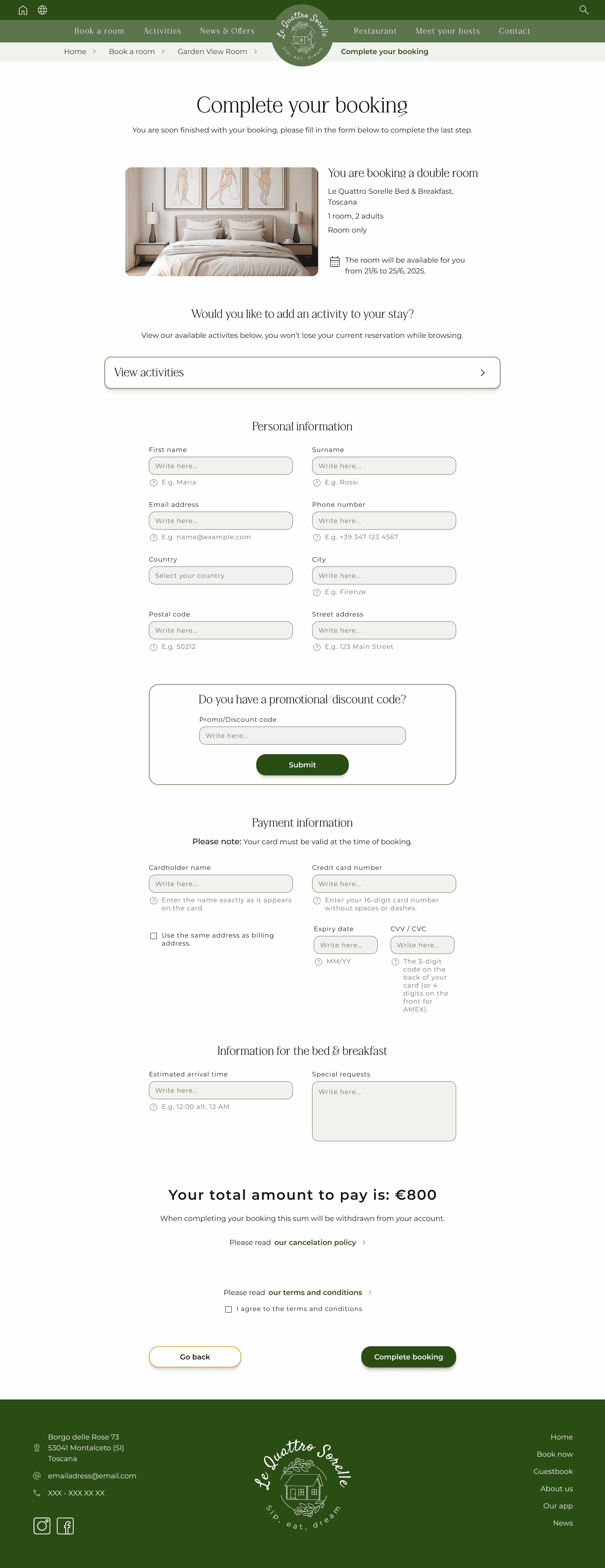
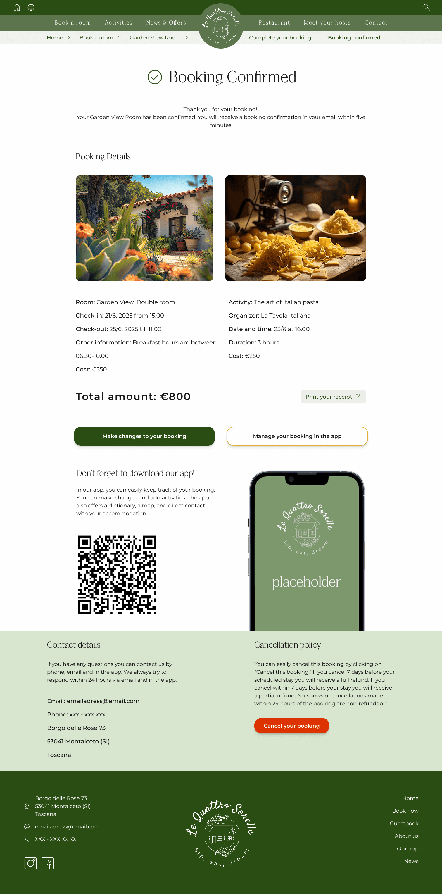
Visual direction
Visual direction is showcased through mockups, animations, and interface designs for the website, app, and physical screen. The focus lies on creating a consistent aesthetic that reflects the brand’s identity while enhancing usability across touchpoints.
Visual direction
Visual direction is showcased through mockups, animations, and interface designs for the website, app, and physical screen. The focus lies on creating a consistent aesthetic that reflects the brand’s identity while enhancing usability across touchpoints.

The full summary
Challenge: Small B&Bs lose revenue and visibility due to third-party booking platforms. Direct bookings are limited by confusing websites, impersonal communication, and lack of control over guest experience.
Solution: A clean, professional website and complementary app provide a trustworthy, easy-to-navigate experience. Encourages direct bookings and enhances guest confidence and satisfaction.
Research: A small survey informed an effect map, guiding design decisions. Four primary user types were considered: Italy Enthusiasts, Group Travelers, Solo Travelers, and Event Guests.
Focus Areas: Key touchpoints shaped the design: communication, personalization, booking clarity, and guest satisfaction. Visuals maintain an elegant, consistent aesthetic across web, app, and physical interfaces.
The full summary
Goal and Solution: ReGo was designed to address recycling challenges in Gothenburg by providing accessible recycling information, a deposit-based reward system, and a station map to simplify waste management and encourage participation.
User Research: Workshops and field studies identified key pain points, including limited access to recycling stations, lack of knowledge, and low motivation. Findings highlighted issues like unclear sorting instructions and excessive waste incineration, which hinder sustainability efforts.
Design & Accessibility: The design system follows WCAG 2.2 guidelines to ensure accessibility and consistency. A structured color palette, Lato typography, a 4pt spacing system, and Google Material Symbols icons were used to enhance readability, usability, and a seamless user experience.
Key Learnings: I’ve learned the value of thinking in systems, particularly when creating a robust design system focused on accessibility. Working in an agile team also emphasized the importance of learning from peers and sharing knowledge to achieve the best results. As we lift each other, the outcomes are stronger.